How to Resize Images Without Losing Quality
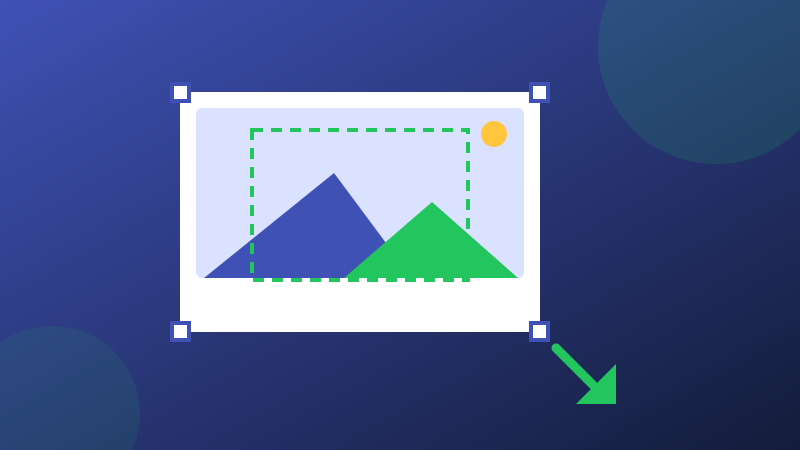
People say resizing destroys quality, but that is only half true. Making an image smaller discards pixels you were never going to see, and done well it looks identical. Making it bigger is where quality truly cannot be invented. This guide gives you the working rules professionals use, so every resize you do stays sharp.
Rule 1: Shrinking is safe, enlarging is not
When you shrink a photo, the software averages many source pixels into each output pixel - the result is clean and often looks sharper than the original at that size. When you enlarge, the software must guess new pixels by interpolation; beyond about 150% the guesswork turns soft and blocky. Plan around this: always start from the largest original you have, and treat the resized copy as disposable.
Rule 2: Match the destination, not a round number
Every destination has a real pixel size. A blog column might be 800 px wide; an Instagram post is 1080; a YouTube thumbnail is exactly 1280 x 720. Resizing to an arbitrary "50%" wastes either quality or bytes. If the destination is a social platform, skip the math and use the presets in the Social Media Resizer; for anything else, the Resize Image tool takes exact pixels or a percentage with the aspect ratio locked.
Rule 3: Never stretch - crop instead
If the target shape differs from the photo's shape, you have two honest options: letterbox (empty bars) or crop (lose edges). Stretching to fit - changing width and height independently - distorts faces and logos and always looks amateur. Cropping keeps geometry truthful; the Crop Image tool's fixed ratios (1:1, 4:3, 16:9 and more) make the common shapes one click.
Rule 4: Format and quality after size
Resize first, then save in the right format at a sensible quality: JPG or WebP around 80-88 for photos, PNG only when you need transparency or pixel-exact graphics. Saving a huge PNG and shrinking later in the CMS throws away most of the benefit. A good order of operations is: crop to shape, resize to pixels, then compress - ImgBleu's Compress JPG shows before/after sizes so you can verify the saving.
Rule 5: Check at 100%, on the detail that matters
Judge the result zoomed to actual pixels on the most detailed area - hair, text, foliage - not on smooth sky. If it holds up there, it holds up everywhere. And keep your original untouched in an archive folder: a resized copy can always be regenerated, an overwritten original cannot.
One workflow that ties it together
In practice the rules collapse into a habit: keep one untouched original, work on a copy, set the shape by cropping, set the size in pixels, save once in the right format, and check the busiest detail at 100%. Five minutes of order beats any amount of rescuing a stretched, twice-resaved file.
The retina rule: when 2x is worth it
Modern phone and laptop screens pack two or more physical pixels into each CSS pixel, so an image displayed at 800 px wide can actually use a 1600 px file before it stops getting sharper. That is the one legitimate exception to "match the destination exactly": for hero images, logos and product shots that sell the page, serving a 2x version is worth its extra bytes. But apply it selectively. A background texture, a small avatar or a below-the-fold thumbnail gains nothing from 2x - the difference is invisible and the cost is paid on every visit, in load time and data. A sensible default: 2x for the one or two images that define the page, 1x for everything else, and always real display size - never the camera's full resolution "just in case".
Put it into practice with the free Resize Image tool - it runs in your browser, locks the aspect ratio for you, and never uploads your files.